
Quick answer
The fastest workflow is simple: upload the image, lower JPEG quality, check the preview, then reduce output scale if the result still needs to be smaller. Use pixel size for blocky damage, blur for soft detail loss, and noise or contrast for a crunchy degraded texture.
If you want a practical result, do not move every slider at once. Start with one primary source of damage. For most images, JPEG compression should be the main change because it creates the familiar artifacts people associate with a lower quality image.
What makes image quality worse?
Image quality gets worse when visible detail is removed, distorted, or hidden. That can happen through compression, resizing, pixelation, blur, noise, or repeated exports. A clean photo can turn into a lower quality image when edges become rough, gradients become blocky, text becomes softer, and small details disappear.
There is a difference between accidental damage and intentional damage. Accidental damage usually looks like a mistake. Intentional degradation uses the same visual clues, but controls them so the image still serves a purpose: a joke, a small upload, an old-web style, a rough screenshot, or a low-quality meme.
Best settings to make image quality worse
Use these ranges as starting points. The right settings depend on the original image, whether text must stay readable, and whether the result should look subtly worse or obviously broken.
| Goal | JPEG quality | Output scale | Pixel size | Blur | Noise | Expected result |
|---|---|---|---|---|---|---|
| Subtle quality drop | 35-50 | 80-100% | 1-3 | 0-1 | 0-12 | The image looks slightly compressed but still clean enough for normal use. |
| Clearly worse image | 22-35 | 60-85% | 2-6 | 1-2 | 8-24 | Visible artifacts, softer detail, and a copied or re-uploaded look. |
| Rough low-quality copy | 12-25 | 45-75% | 4-10 | 0-1 | 18-45 | A small, visibly damaged image for jokes, reposts, or rough previews. |
| Readable screenshot damage | 28-42 | 75-100% | 1-4 | 0 | 0-15 | UI and text remain partly readable while edges and gradients look worse. |
| Extreme image damage | 4-15 | 25-60% | 8-20 | 0-2 | 35-75 | Strong compression, lost detail, rough texture, and obvious degradation. |
Method 1: Lower JPEG quality
JPEG quality is usually the best first control because it changes both the visual texture and the downloaded JPG size. A setting around 35 to 50 creates a light quality drop. Around 22 to 35, the image starts to look copied or re-uploaded. Below 15, the artifacts become harsh enough for extreme damage or meme-style images.
This method works especially well for photos, gradients, and screenshots with thin edges. If the result is still too clean after lowering JPEG quality, add a small amount of pixelation or noise instead of forcing the quality value all the way down.
Method 2: Reduce output scale
Output scale changes the exported dimensions before the image is saved. It is useful when the goal is a smaller file, a lower resolution look, or a rough copy that travels faster through slow uploads. Scale around 70% to 90% keeps the image readable. Scale around 45% to 70% makes the quality loss more visible.
If the image will be displayed large, do not reduce scale too far. A very small output can look worse than intended because the browser or social app may stretch it back up.
Method 3: Add pixelation
Pixelation makes quality worse by grouping details into visible square blocks. Small values create a mild low-resolution feel. Medium values work well for low-quality memes, avatars, and copied images. Large values are best when losing detail is the point.
Use pixelation carefully on screenshots. Text can become unreadable quickly, so keep pixel size low if the image contains labels, captions, code, menus, or interface details.
Method 4: Add blur and noise
Blur makes an image look softer, less sharp, or more like a bad camera photo. Noise makes the result rougher and more chaotic. They are useful finishing controls after compression and scale are already set.
Avoid heavy blur when you want a crunchy degraded image. Crunchy images need visible edges and artifacts. Too much blur removes those edges and can make the result look soft instead of intentionally damaged.
When to use each method
Each quality-loss control has a different job. Choose the method that matches the problem instead of treating every setting as the same kind of damage.
| Method | Best for | Main risk |
|---|---|---|
| Lower JPEG quality | Compression artifacts, smaller JPG output, copied-image texture | Too low can destroy text, gradients, and faces. |
| Reduce output scale | Smaller KB, lower resolution, faster uploads | The image may look tiny or soft when displayed large. |
| Increase pixel size | Blocky low-resolution damage, memes, censored details | Large values can hide the subject completely. |
| Add blur | Bad camera feel, soft screenshots, lost sharpness | Too much blur removes useful compression texture. |
| Add noise and color damage | Crunchy style, rough reposts, deep-fried effects | Noise can increase file complexity and make the result larger. |
Controlled experiment: one setting at a time
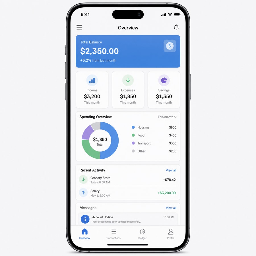
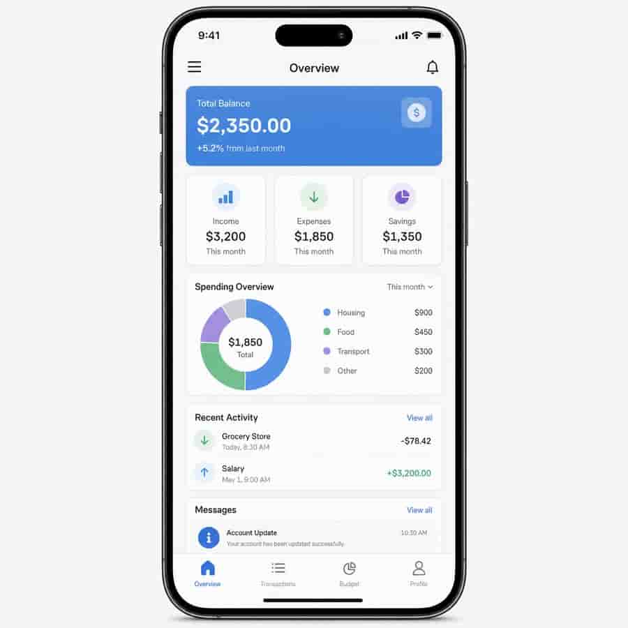
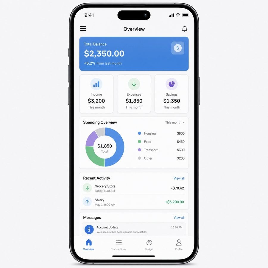
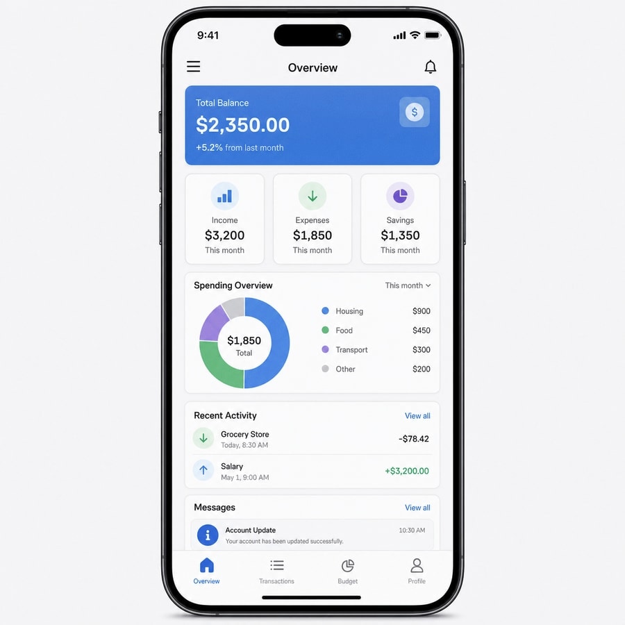
These examples use the same source image, the same crop, and the same comparison frame. Only one setting changes per card, which makes it easier to compare JPEG quality, output scale, pixel size, blur, and noise without mixing the effects together.
- Source
- 900x900 JPEG
- Original size
- 68 KB
- Baseline
- No effect
- Goal
- Controlled degradation
Common mistakes
The most common mistake is using too many effects at once. If JPEG quality, pixel size, blur, noise, saturation, and contrast are all pushed high, the image may stop looking intentionally low quality and start looking broken. Make one change, preview it, then add the next layer only when it improves the result.
Another mistake is adding noise before reducing file size. Noise can make an image look worse, but it can also make JPEG compression less efficient. If the goal is smaller KB, use Reduce Image Size KB first, then add noise only when the file is already close to the target.
Use the right tool page
For precise degradation controls, use the Image Quality Degrader. It is the best fit when you want to degrade image quality with JPEG compression, pixels, blur, color, and noise.
For a simpler upload-and-download workflow, use the Low Quality Image Maker. If you are working with a photo specifically, see How to Make a Photo Look Low Quality.
If JPEG compression is the main effect you want, read the JPEG quality settings guide. If the image needs blocky damage, use the pixelation guide.
FAQ
How do I make image quality worse on purpose?
Lower JPEG quality first, then reduce output scale if file size matters. Add pixelation, blur, and noise only after the basic compression level looks right.
What setting makes image quality worse the fastest?
JPEG quality usually changes the look fastest because it adds visible compression artifacts. Output scale is usually the fastest way to reduce file size.
Is making image quality worse the same as resizing?
No. Resizing changes dimensions. Making image quality worse can include resizing, but it also includes JPEG compression, blur, pixelation, noise, and color damage.
Can I degrade image quality without making the image unreadable?
Yes. Keep JPEG quality around 25 to 45, use output scale above 70%, keep blur under 2, and use small pixel sizes if text or faces need to remain recognizable.
Why does noise sometimes make the file larger?
Noise adds visual detail that JPEG compression has to store. If smaller KB is the goal, lower JPEG quality and output scale before increasing noise.
Which page should I use for image quality degradation?
Use the Image Quality Degrader when you want precise control, the Low Quality Image Maker when you want a simple low-quality result, and Reduce Image Size KB when file size is the main goal.